As the days speed by towards half-way through my INH treatment, I have been feeling that it is time for an update. However, I have nothing to report for myself. I have no isoniazid side effects and my monthly refill visits to the Texas Health Department have been so easy as to be near delightful. After an errant blood sugar test result during a routine liver function test returned a value so low that I basically shouldn’t be able to wake up in the morning, I did a few days of self-monitoring. Turns out I’m fine. Perfectly boring, normal blood sugar values. The lack of passing out or cold sweats had me feeling confident about this one, but you never know.
Instead, I would like to present some interesting results from my constant website analytics surfing. Upon second reading, I realize that the descriptor “interesting” is relative. The rest of this post is me getting nerdy with my numbers. Since writing about and posting my TB test result pictures, my site has become much more popular – with a certain crowd. I have daily traffic from people looking for TB-related content. So, let’s take a look at some numbers. You have been warned, twice now. To simplify matters a little, I am only going to look at traffic from the US. I will attack the international statistics in the future.
To start, what are the interesting questions?: how many people are coming to the site for TB content, and which TB content; how are they finding the content, i.e., searches; where are they coming from; what do they look at on the site; and do they come back.
The location part is especially interesting. Gets me thinking about disease tracking, or maybe just TB screening in this case. I wonder with more time and data if some connection could be found between the locations of people searching and TB screenings and/or LTBIs. I will certainly let you know when the CDC comes asking for my data.
I have 4 posts explicitly about the consumption that I am using for this analysis: that quite a TB test…,Round 2, Chest X-ray, and 7 days down
What?Â
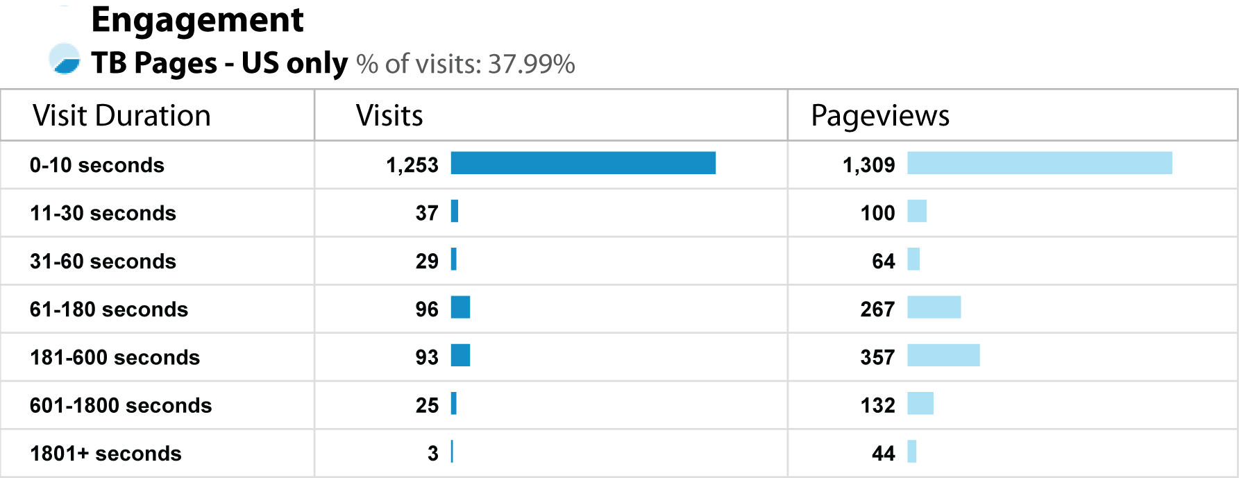
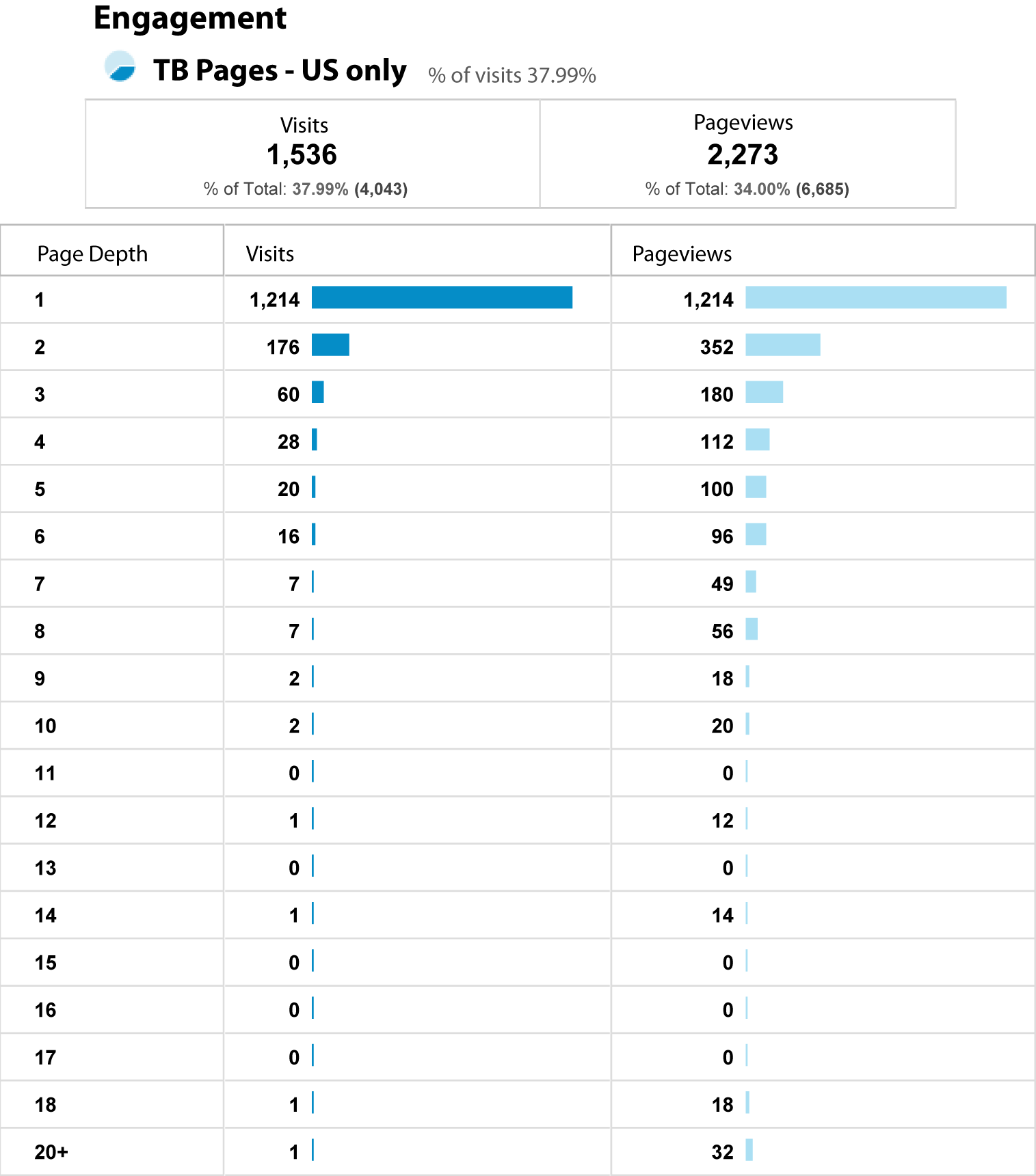
Since posting the first TB update on January 12th, the 4 TB posts have received 1,536 Visits from 1,476 Visitors, comprising 38% of my total visits, and 46% of my total visitors. These visits have resulted in 2,273 pageviews.
The first TB post get’s the lion’s share of the visits – 1,336 visits, 87% of all these visits.
96% of these visits come from new visitors who spend an average of 45 seconds on the site. 1,468, of the visits were single visits. Hmmm… my user engagement is clearly lacking. I’m not keeping people around. These readers are in and out for the information about TB.
Where?
I love heat maps with bubbles. Even better would be if I had time to overlay the map of my TB visitors with US population, but that just isn’t going to happen today. What you don’t get to see, but is even better about cruising around the full data set is that I get to keep zooming down into the detail. Just a couple of maps here for now though.
Lincoln, Nebraska, I don’t know what you have going on there, but you stand out a bit in the middle of the country. However, you aren’t spending enough time to really read anything, so I don’t know what is going on. I extend my thanks to Austin, Seattle, Houston, and all the other cities where you are reading my content, and checking out some other posts as well.
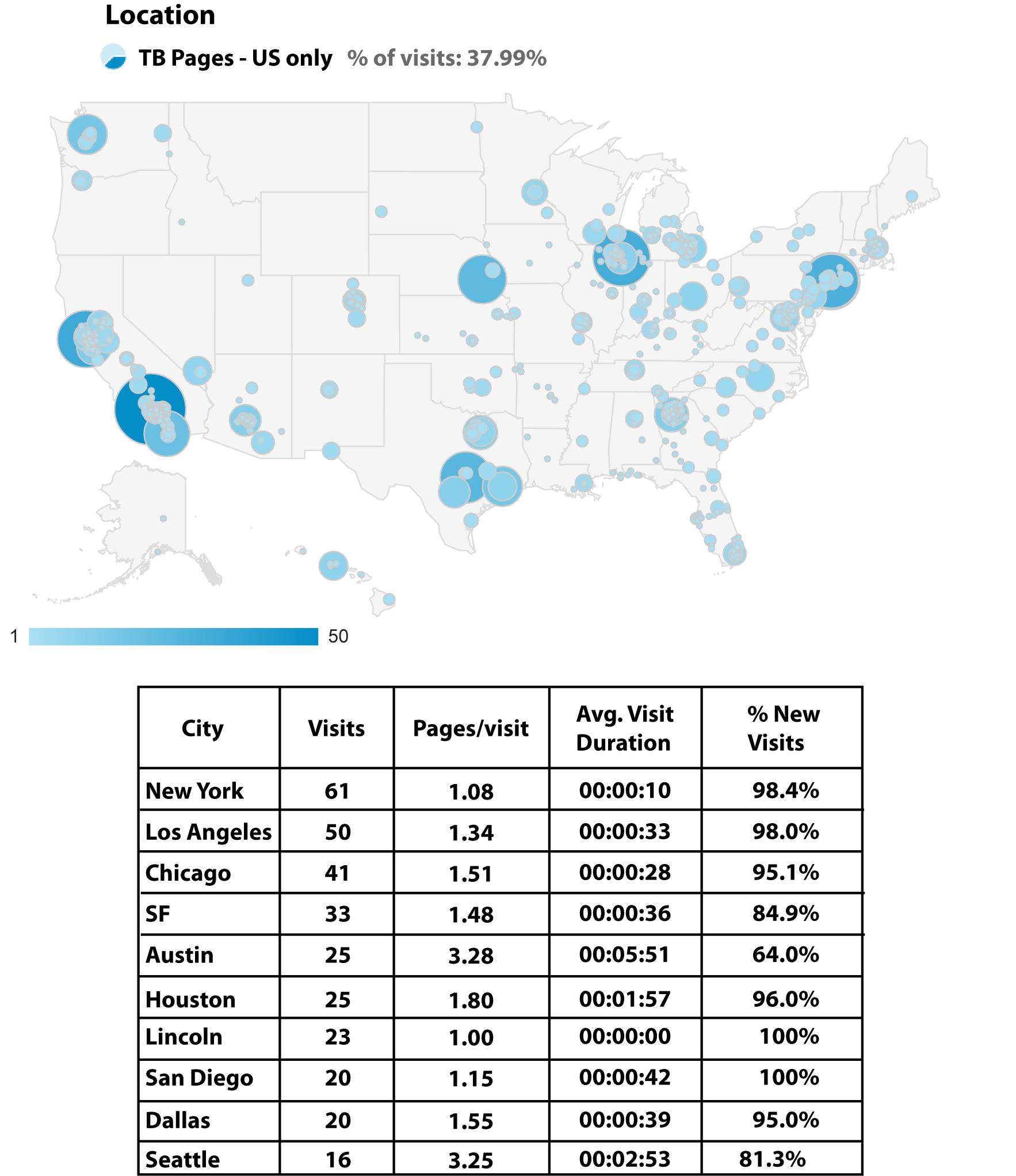
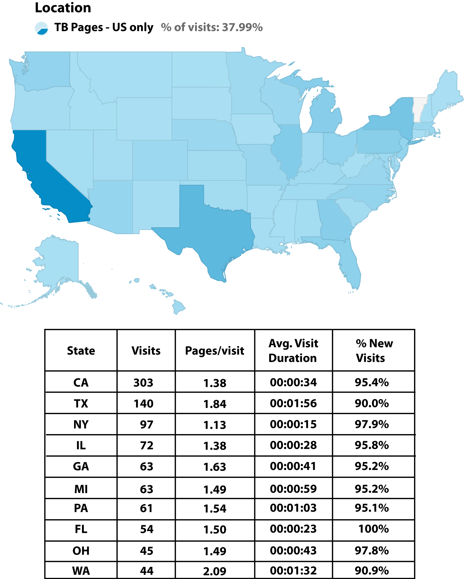
Good job Vermont! You are the only state that has no interest in TB testing. If I may be so bold as to say so. Clearly if you are not even stumbling upon my site for a second, then there is zero interest in TB there. Still, not even family members in other states that drive some curious searches? Does the speed reading in New York state have any relationship to the speed with which people talk there? So many more questions! But I will never post this if I can’t be satisfied with this preliminary investigation.
How?
51% of this TB traffic comes to my site via search. The top 10 search keywords are:
“positive tb skin test”, “positive tb test”, “tb test positive”, “tb test”, “what does a positive tb test look like”, “tb skin test”, “positive tb test results”, “positive tb test look like”, “positive tb test on arm”, “positive ppd test”
I think you get the idea. The next 20 keyword terms are slight variations on those, with some TB chest x-ray terms thrown in, and my name.
I’m still digging into the image search versus regular search, and the resulting downloads. Apparently quite a few people want to save my induration and chest x-ray pics. I try to keep an eye on where they are ending up, but I’m sure I’m not doing a very good job. This goes with a larger question I have been wrestling with. To watermark or not to watermark?
When?
Not really as interesting to look at what time of day people are searching. The larger question of looking for spikes in visits by geographical region is fascinating, but I just don’t have time to delve into it right now. It’s taken me long enough to get this info sorted and uploaded.
Who?
This should either be the summary section to draw conclusions about my TB-loving audience or a section on what type of operating system, browser, and device people are coming to my site from, but that is even less interesting. I refer you to my comment re:time in the When? section above to explain my lack of analysis. Besides, that’s not the point. I get to look just as much into the data as I want to here, and no more. Comment below if you have specific questions, and we will do it up next time!
Even after two warnings, I kept reading … and I enjoyed it. I guess that makes me a data geek, too, although not as dedicated or as skilled as you.
Haha, nice try, but I don’t think you can step away from your geek credentials. Of course you kept reading. How many programming languages have you learned “for fun”?